lumi adaptogens
LOGO | BRAND GUIDE | PACKAGING | COLLATERALS

The founder of Lumi had a powerful vision: a line of adaptogenic mushroom blends that could resonate with both American and Mexican audiences. From visual identity to packaging and social content, I was part of the brand’s creation from the very beginning.
Approach
I developed an analog-inspired identity that celebrates Mexican papel picado traditions while meeting modern wellness market demands. Moving away from clinical aesthetics typical in the adaptogen space, I focused on creating something that felt personally crafted, vibrant, touchable, and authentic. The strategy was to bridge cultural authenticity with commercial appeal, ensuring the brand could resonate with both American and Mexican audiences.
ROLE: Logo Designer, Brand Guide Designer, Motion Designer, Packaging Designer, Project Management
Logo Design
The primary mark features a bold, mushroom-inspired form with chunky typography that mimics hand-cut paper. Designed to feel tactile and approachable, the blocky construction allows it to function as both identifier and pattern element, reinforcing the handcrafted positioning while ensuring strong recognition across all applications.
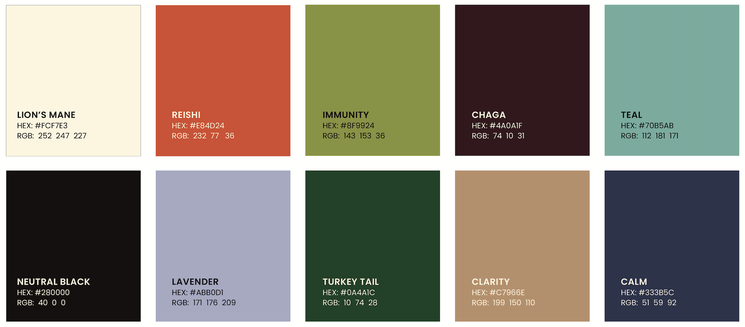
Color Palette
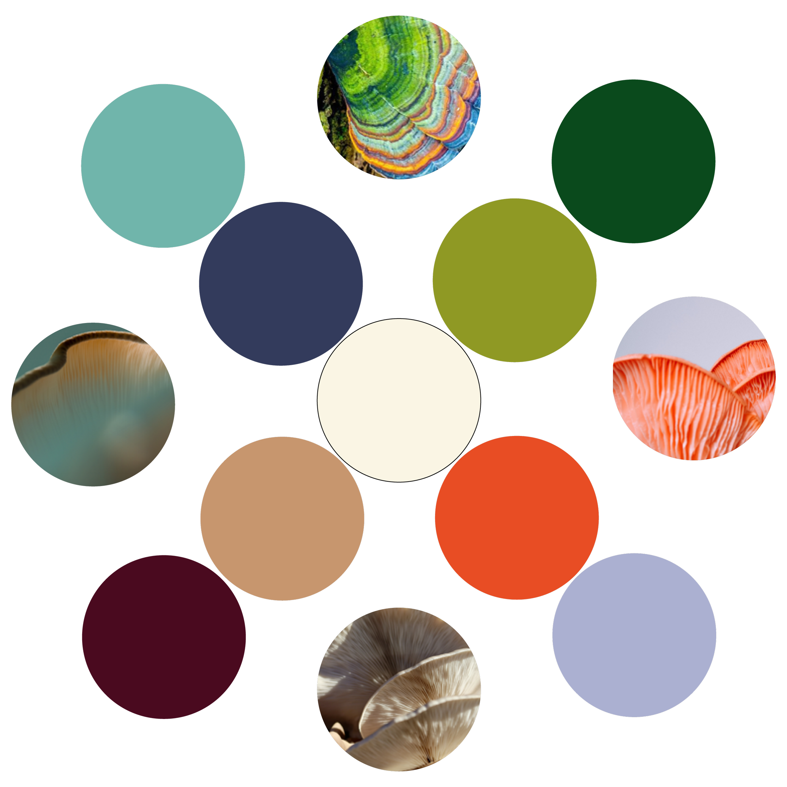
Instead of typical earthy wellness tones, I extracted vibrant hues directly from adaptogenic mushroom ingredients. Each variant received dedicated color stories: Energy (red, lavender, cream); Clarity (cream, dark brown, white); Calm (blue variations); Immunity (greens with cream). Creating distinct product personalities within a cohesive system.
Brand Guidelines
Created a comprehensive system designed for independent application, including flexible templates and usage guidelines that enable consistent brand expression. The guide empowers the client to maintain authentic handcrafted integrity across any medium while scaling their brand effectively.

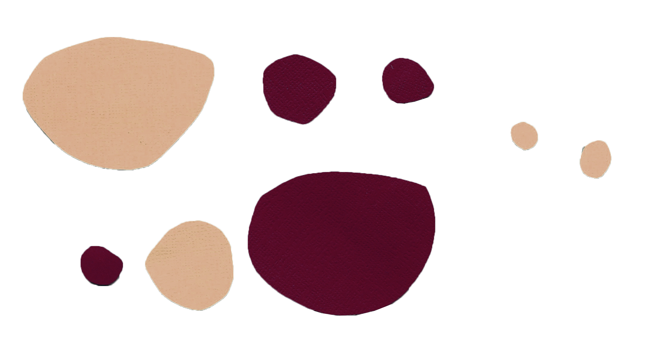
Graphics and Patterns
Hand-cut cardboard shapes in brand colors were scanned and digitized to create unique symbols for each variant. Patterns inspired by papel picado traditions and logo-based repeating elements add depth and authenticity. Drop shadow effects enhance the analog, scrapbook-inspired aesthetic throughout all applications.


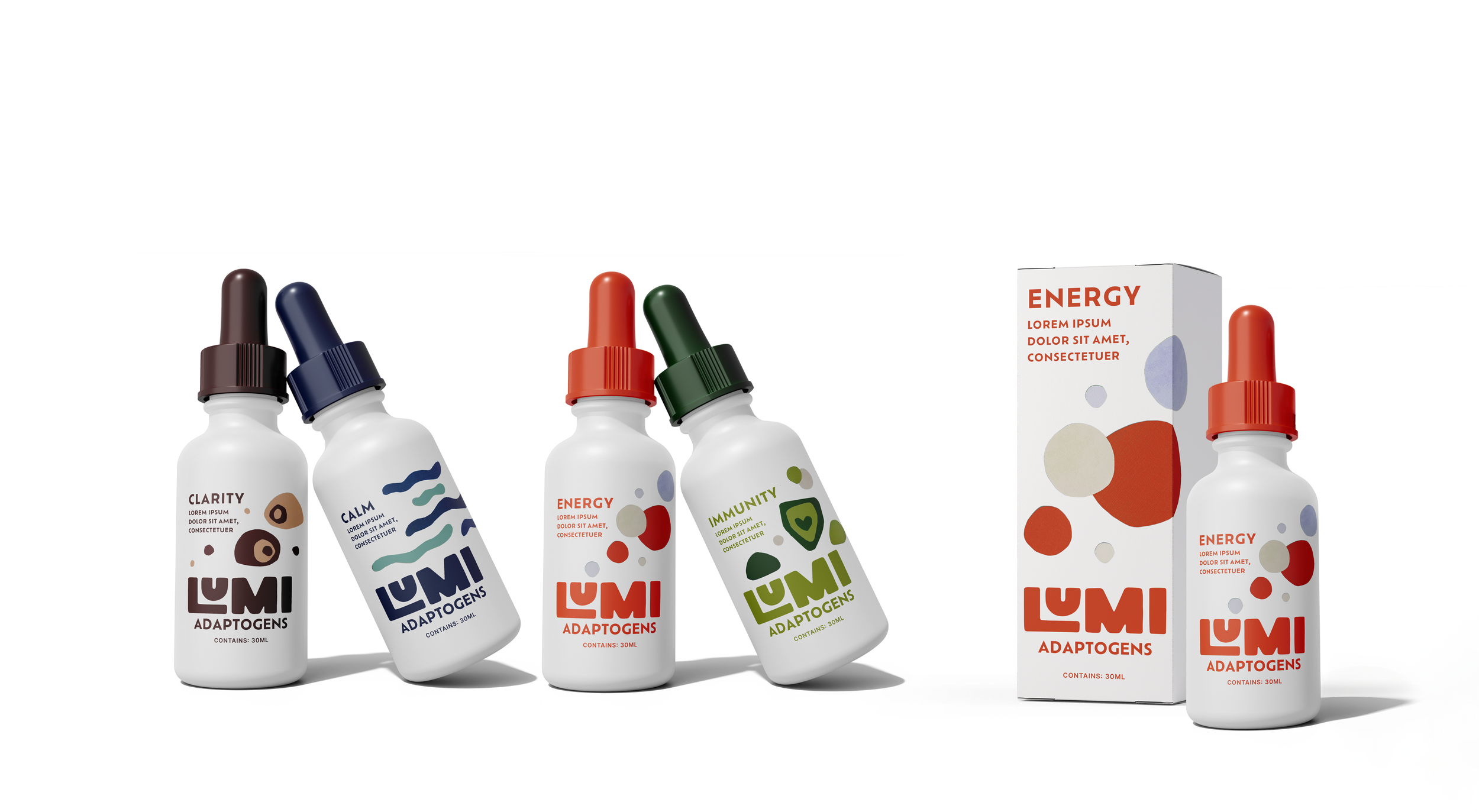
Packaging Design
Four-variant system using dedicated color palettes and custom analog graphics. Each package features hand-crafted symbols that communicate specific benefits while maintaining strong brand recognition.
Social Media Graphics
Developed a content library that showcases the brand's handcrafted personality through layered analog elements, vibrant color combinations, and playful typography treatments. Templates allow for consistent posting while maintaining the authentic, personal feel that differentiates Lumi from clinical wellness competitors.


